Consupedia
No 1 About Project
Consupedia is an application that helps consumers to make informed, sustainable and healthy decisions when grocery shopping.
In this project, the client's original application was evaluated and redesigned in line with clients main objectives. This resulted in a new visual identity with a detailed UX design for 25 key pages of the app. A clickable prototype was usability tested and improved with four iterations.
No 2 The process
UX designs with the clients main goal in focus and usability research to support and improve the design decisions
- Defining the client's main goals and challenges
- Usability test client's current solution
- Analyse the finding and consult with the client
- Create new UX designs inn clickable prototype
- Usability research
- Four iterations of UX design and usability research
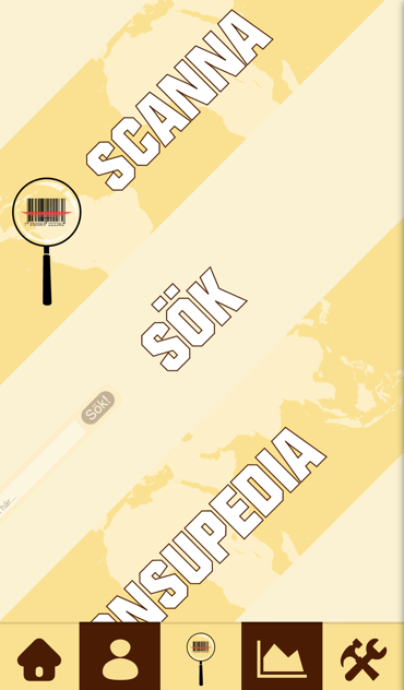
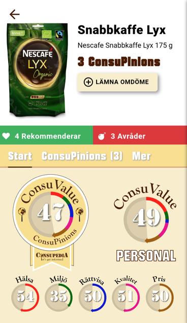
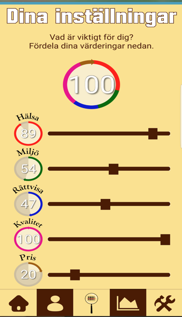
Clients original design
One of the clients main goal was that users could tailor their consumer behaviour and values; another goal was to provide value for the user. A usability test was carried out with the client's current design. Five users participated and performed predefined tasks which were screen recorded. The users were asked to think out loud. The evaluation of the client's app showed that users did not quickly understand the provided value and found the preference setting process complicated. The users also found the design unappealing and the mix of different colours enhanced the information overload. The client allowed me to change the visual identity when redesigning the Consupedia app.
Design Iterations
A new visual identity with a detailed UX design for 25 key pages was made into a clickable prototype. New users were obtained, and usability tests were carried out. The usability test included task-based scenarios that were screen recorded, and the user asked to think out loud. After each session, the user answered a questionnaire written by another person than me to avoid biased questions regarding the UX design. This process was made four times after analysing the findings from the qualitative and quantitative results. The design iterations resulted in several new features aiming at providing better visualisation and eco-feedback were changed. The rating of a product was shown with globes to indicate the connection to sustainability. The most sustainable product was highlighted with a "Best choice" medal to assist users' shopping decision.
No 3 The final design
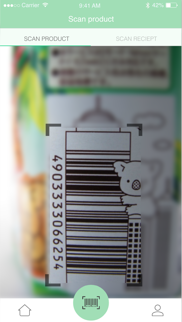
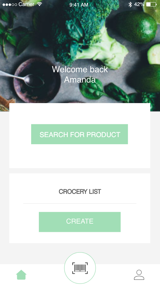
Users of Consupedia can easily scan products or receipts
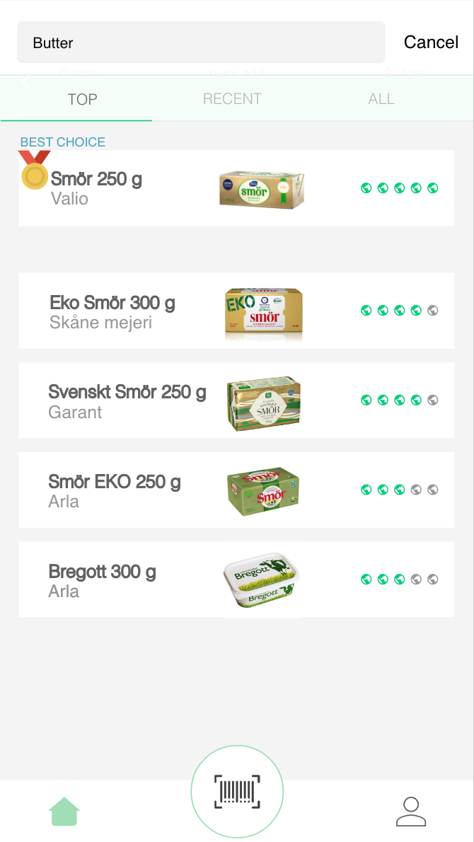
Search for a specific product and get the best result in all categories. A design decision taken to avoid information overload.
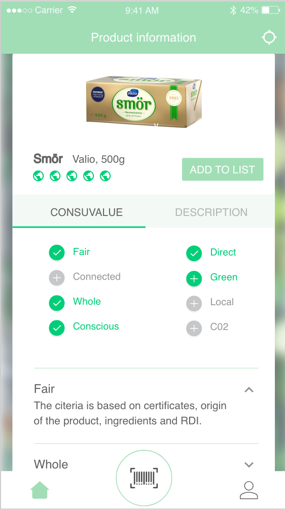
Listing basic information about the product. By tapping on the description, the user can see the more specific information. If required, the user can add the product to a shopping list
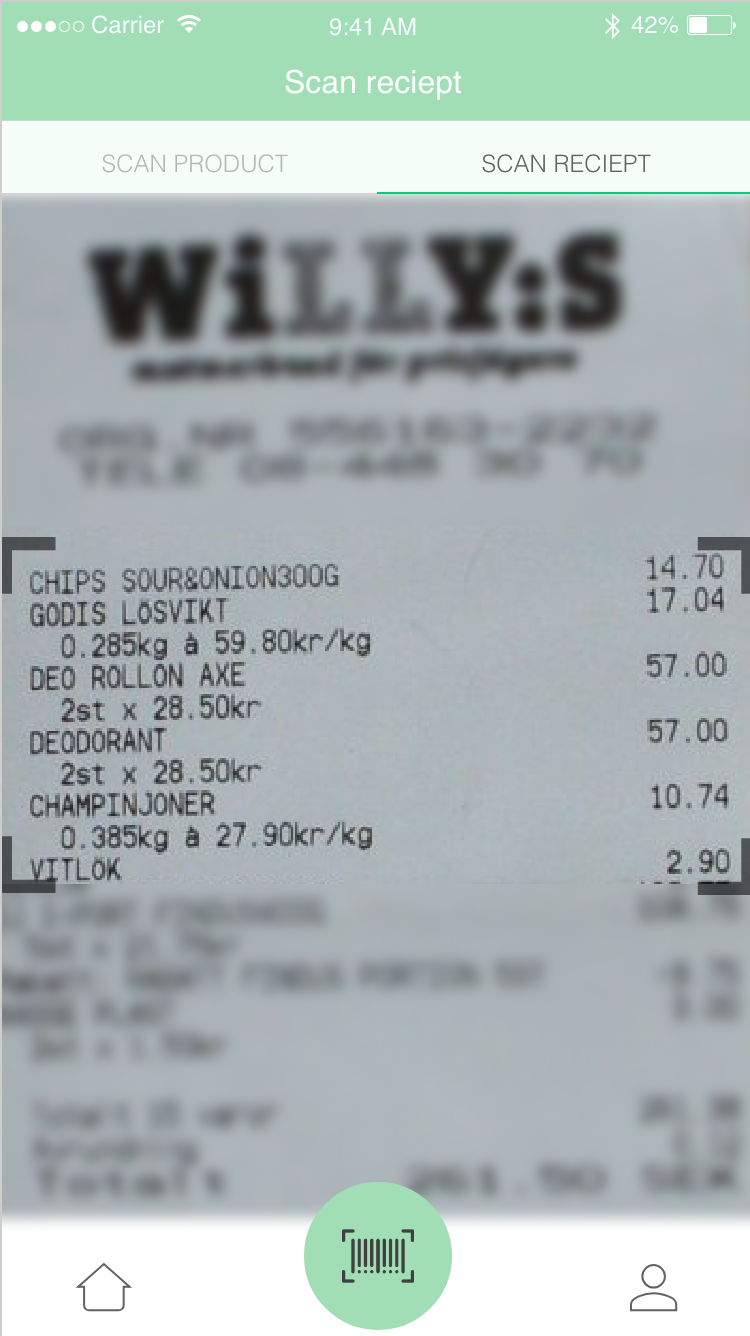
Users of Consupedia can easily scan products or receipts
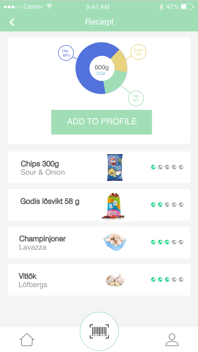
A visual chart that shows C02 emissions and ingredients.
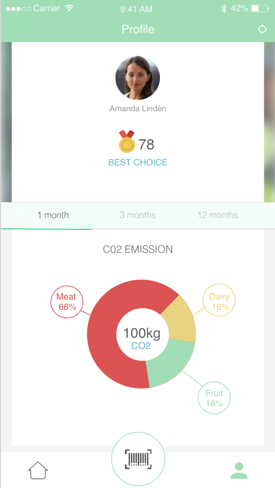
Detailed personal information such as how many times the user has selected the most sustainable choice and the users' carbon footprint.
No 4 Roles
- iOS Application
- UI/UX
- Usability Testing
- Eco-feedback Studies
- Interface Design